How to Make Your Website Accessible to Visually Impaired Users
Business 101 | November 17, 2021
Business 101 | November 17, 2021
Browsing the internet is typically a visual experience. Websites have text, images, videos, and dozens of building elements, commonly distinguished by sight. However, this entire concept makes it pretty much difficult for visually impaired people. Due to color blindness, partial vision, or complete blindness, they are often unable to access and perceive the content. Unless designers and developers implement some of the essential rules to make your website accessible to visually impaired users. Basically, these rules allow them to consume the information the websites are offering, but also provide websites with the opportunity to expand their audience. With good guidance, accessibility, and usability, every website will be able to accommodate the needs of all its visitors, regardless of the impairment or any other difference.
In simple words, web accessibility allows people with disabilities to conceive, interact, navigate, and understand websites. It's a set of guidelines that helps designers and website developers create a good user experience for everyone. Also, designing websites with accessibility in mind expands the potential audience for websites as well. If you consider that one in ten people have a visual impairment, a 10% increase is considerable.
Here is the list of tips you could use to make your website accessible to visually impaired users:
Those with visual impairments usually use the Screen Readers to access and read the content of a website. It's a specific "text-to-speech" software that "translates" the content to audio so they can hear it. When creating a website, it's necessary to first understand how this software works. Readers scan the entire content and announce what it contains, one line at a time, title by title, and element by element.
Unfortunately, more serious visual impairments prevent visitors from using a cursor to navigate the website. However, this is circumvented by browsing the website with a keyboard. That's why enabling keyboard navigation is essential if you want to fulfill the expectations of users and create a user-friendly website. Furthermore, another way to make things easier is to create and provide your visitors with a list of shortcuts. It will make the experience more pleasant and efficient. In addition, ensure the more complex elements like widgets, carousels, and similar elements are accessible.
Caption: Don’t rely only on “mouse” for navigation.
Alt-tag: Using a keyboard to navigate a website.
Other elements without which the Screen Reader will be useless are headings. All the H1 to H6 headings should be used for the proper formatting of your page content. Not only do they help to keep everything in order, but they also serve as browsing nodes. When visitors "scroll" through your page, headings are pointers and will inform them about incoming content, just like when you read. One of the useful tips is to always use only one H1 on your page for the main title and structure other Hs for the rest of the content.
Web accessibility, in general, helps with organization. All the titles, headings, elements, and text will be properly structured for a better user experience. On the other hand, accessibility also improves your SEO efforts. One of the tricks to improve this further is to give visitors the option for customization. If someone has trouble reading a small or specific type of font, make it changeable. Give the power to the visitors to increase the font size or even change the font family. While most browsers have integrated features to zoom pages, not everyone knows about it. Nor is it always efficient with giving the right results. But one simple adjustment like this on a properly structured website can make all the difference.
Caption: Accessibility and user experience goes hand in hand with SEO.
Alt-tag: An illustration of factors that influence SEO.
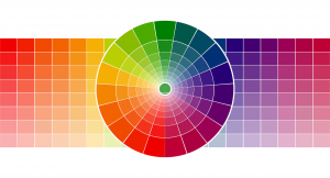
A lot of confusion can happen when people with color blindness visit colorful websites. While some color combinations might be appealing from a designer's perspective, some can easily ruin your website's accessibility. That's why it's necessary to spend a bit more time choosing the right palette. For this, there are many tools like the Color Safe that can help. This tool can provide you with the right suggestions about what combination to use so that it doesn't present a problem for the visually impaired.
Carefully choose your color combinations since some people suffer from color blindness.
Besides the palette, it's important to remember that contrast can easily improve or degrade readability. This is especially important when combining background color with the text color. According to suggestions, the 4.5:1 contrast ratio is a minimal requirement for normal, and 3:1 is a minimum for large text. Again, different tools can help you test the contrast on your website. Also, software like Sketch and Photoshop have their own features to help you get the right contrast. From other tools, there is Colour Contrast Analyser, NoCoffee, and many more.
While most people are getting used to the idea that red is a warning or green is "ok", those rules don't apply with accessibility. At least, not in the same way. Since there are different degrees of visual impairment, you will need to combine more than one approach. For alerts, warnings, CTA, and other interactive elements, color orientation is simply not enough. If you want better accessibility, you will need to use a few other tricks for better clarification. For example:
In the ideal case, each element should contain multiple visual and textual cues. Overall, it will help with accessibility regardless of the degree of visitor's impairment. It will also help with search engine optimization, in addition.
Last on this list is the use of alternative text. For elements on a website that doesn't include text, it's crucial to have something to describe them. Otherwise, people who use screen readers will have no clue about what an image, for example, is about. Sometimes, they won't even know the image exists. That's why it's crucial to provide a descriptive but short alternative text.
Today, creating a website is not as simple as it used to be. There are many rules, guides, and suggestions to follow if you want them to function properly. Not only does a website have to have a beautiful design, but you also have to make your website accessible to visually impaired users. Make it a priority because it's, before all, a moral and ethical thing to do.